インターフェースのMOD制作
旧版向け資料
原文はゲームバージョン3.7向けです。現在の構文やハードコードされた挙動とは異なる可能性があります。
StellarisのGUI改造は簡単ではなく、挙動が直感的でない場合もあります。それでも、既存要素の変更やゲーム内への新要素追加に使える仕組みは用意されています。
はじめに
インターフェースファイルはすべてStellaris/interface/にあり、.guiと.gfxに分かれます。前者は画面構造、後者は画像スプライトのライブラリです。このフォルダはLIOS方式でファイルを読み込みます。
作業を速めるため、次のコンソールコマンドを把握しておくと便利です。
reload [file name].gui—.guiファイルの変更をゲーム内で再読込します。.guiだけに対応します。reload texture all—.gfxから参照される全テクスチャを再読込します。allを特定の参照名に変えれば1つだけ再読込できます。画像の解像度を変えた場合は手動再起動が必要です。guibounds— マウスポインター用のUIデバッグツールチップを有効にします。要素がどのファイルにあるか探すのに便利です。debugtooltip— ツールチップの情報を増やし、UI要素をCtrl+Alt+右クリックするとGUIファイルを開く/インターフェースを再読込できるようにします。3.7で追加されました。
一部要素は、Definesのinterfaceカテゴリにある値で制御されます。
変数
変数は単純なデータを保持し、コードの反復を減らします。@myvar = 200のように@で宣言し、再宣言はできません。使用する要素に適した単純な文字列または数値に対応します。.gui内のどこでも宣言できますが、要素の入れ子を上へ遡ったり横断したりはできません。
@myvar_pos_y = -200
@myvar_width = 50%
@myvar_height = 100%%
@my_background = "GFX_tile_large_center_bg"
@my_orient_ll = lower_left

containerWindowType = {
    name = "my_element"
    size = { width = @myvar_width height = @myvar_height }
    position = { x = 35 y = @myvar_pos_y }
    orientation = @my_orient_ll
    background = {
        name = "background"
        spriteType = @my_background
    }
}
条件付きコード
ゲーム本体ではほとんど使われませんが、現在の解像度に応じた条件付きコードを書けます。あらゆる要素に使え、縦横両方または片方の条件を満たしたときだけ属性や要素を有効にします。
条件はif_resolutionとif_scaled_resolutionの2種類です。前者は生の解像度、後者はUIスケーリング適用後の解像度を使います。3840×2160をUI倍率0.5で表示する場合、後者では1920×1080向けのコードが使われます。
if_resolution = {
    min_width = 1920  # min_widthまたはmax_width
    min_height = 1080 # min_heightまたはmax_height
    # 1920×1080以上のときだけ適用
}

if_scaled_resolution = {
    max_width = 1280 # min_widthまたはmax_width
    max_height = 720 # min_heightまたはmax_height
    # 1280×720以下のときだけ適用
}
動的テキスト値
ツールチップとイベントウィンドウ以外に表示される大半の値は、特定の内部変数へハードコードで結び付いています。通常のUI要素では、角括弧[]コマンドを含むローカライズは処理されず、コマンドそのものが固定テキストとして表示されます。例外はeffectButtonTypeです。Variablesの変数値を表示したい場合、機能するローカライズはeffectButtonTypeのbuttonTextだけです。
GUIファイル
GUIファイルはユーザーインターフェースの配置を定義するオブジェクト指向の構造です。全要素をguiTypes = {}内で宣言します。大半の要素はハードコードされた関数に制御され、独自GUIで完全には利用できませんが、バニラの既存要素なら属性を変更できます。一部の例は/interface/reference.txt、残りはバニラの各インターフェースファイルにあります。
要素の種類
| 要素 | 種類 | 変更可能範囲 | 説明 | 属性 |
|---|---|---|---|---|
| containerWindowType | コンテナ要素 | 属性と内容 | GUIを構成する主要なコンテナ要素。 | name, position, size, moveable, clipping, orientation, origo, background, alwaysTransparent |
| buttonType | 操作要素 | 属性のみ | 通常はハードコードされた操作に結び付くボタン。見せかけの背景などの画像表示にも使える。 | name, position, orientation, buttonFont, buttonText, appendText, oversound, clicksound, shortcut, format, vertical_alignment, pdx_tooltip, alwaysTransparent, web_link, rotation |
| effectButtonType | 操作要素 | 属性とeffect | buttonTypeに似るが、/common/button_effects/のイベントをeffect属性から呼び、custom_guiも実行できる。pdx_tooltipは機能しないため、button effect内のcustom_tooltipを使う。 |
name, position, orientation, buttonFont, text, appendText, oversound, clicksound, shortcut, format, vertical_alignment, effect, alwaysTransparent |
| iconType | 画像要素 | 属性と内容 | 画像やアイコンなど、グラフィック表示専用の要素。 | name, position, orientation, spriteType, quadTextureSprite, frame, scale, pdx_tooltip, alwaysTransparent, rotation, centerPosition |
| instantTextBoxType | テキスト要素 | 属性と内容 | 直接入力またはローカライズ参照によるテキストを表示する。 | name, position, orientation, font, text, appendText, maxWidth, maxHeight, fixedSize, format, vertical_alignment, text_color_code, pdx_tooltip, alwaysTransparent |
| scrollbarType | スクロールバー要素 | 属性と内容 | listboxType、smoothListboxTypeや設定画面のスライダーのスクロール動作を定義する。縦横に対応。 | |
| extendedScrollbarType | スクロールバー要素 | 属性と内容 | containerWindowTypeのスクロール動作を定義する。縦横に対応。 | |
| spinnerType | カルーセル要素 | 属性と内容 | 設定画面にあるような、クリック式カルーセルの動作を定義する。 | |
| guiButtonType | 操作要素 | 属性のみ | buttonTypeと同様だが、スクロールバーとspinnerType専用。 | |
| positionType | 位置要素 | 属性のみ | 特定要素の位置を定義する。参照関係はハードコードされる。 | |
| listboxType | リスト要素 | 属性のみ | スクロール時に子要素単位で移動するスクロール可能リスト。 | |
| smoothListboxType | リスト要素 | 属性のみ | 滑らかにスクロールするリスト。 | name, position, size, orientation, alwaysTransparent, borderSize, spacing, scrollbartype, offset, defaultSelection, priority, autohide_scrollbar |
| overlappingElementsBoxType | 横リスト要素 | 属性のみ | 内容を横方向に並べ、幅の上限へ達すると互いに重ねる。 | |
| gridBoxType | グリッド要素 | 属性のみ | 縦横の上限に応じ、内容をグリッド状に並べる。 | name, position, size, orientation, alwaysTransparent, slotsize, format, add_horizontal, max_slots_horizontal, max_slots_vertical |
| checkboxType | 操作要素 | 属性のみ | はい/いいえを選ぶ画像付き操作ボックス。 | |
| editBoxType | 操作テキスト要素 | 属性のみ | ゲーム内オブジェクトの改名などに使う編集可能なテキストボックス。 | |
| dropDownBoxType | ドロップダウン要素 | 属性のみ | expandButtonとexpandedWindowを収めるドロップダウン用コンテナ。 | |
| expandButton | 操作要素 | 属性のみ | buttonTypeに似るが、開閉可能なexpandedWindowと結び付く。 | |
| expandedWindow | 開閉式コンテナ要素 | 属性と内容 | expandButtonで開閉するコンテナ。 | |
| windowType | 浮動コンテナ要素(?) | 属性のみ | 浮動コンテナ要素(詳細不明)。 |
要素の属性
以下は前述の要素で使える既知の属性と、その機能です。必須属性はnameだけです。
| 属性 | 説明 | 値 | 既定値 | 例 |
|---|---|---|---|---|
| name | 要素名。同じ親を持つ要素の間で一意でなければならない。 | テキスト | name = "planet_view" | |
| position | 親を基準にした位置。整数だけに対応する。 | [x] [y] | 0 | position = |
| size | 要素の大きさ。種類によりwidth/heightまたはx/yを使う。height = 100は固定値、height = 100%は親基準、height = 100%%は親サイズからこの要素のpositionを引いた値、height = -10は親サイズからこの要素のpositionと指定値を引いた値。x/yは正の整数のみ。 | [width] [height]または[x] [y](要素の種類による) | 0 | size = |
| moveable | 要素を移動可能にする。background属性が必要。 | yesまたはno | no | moveable = yes |
| clipping | 要素の大きさを超えた内容を隠す。 | yesまたはno | no | clipping = yes |
| orientation | 親要素を基準にしたアンカー位置。基準点はorigoで指定する。 | upper_left, upper_right, lower_left, lower_right, center, center_up, center_down, center_left, center_right | upper_left | orientation = lower_right |
| origo | orientationを使うときのアンカー基準点。 | upper_left, upper_right, lower_left, lower_right, center, center_up, center_down | upper_left | origo = center_up |
| alwaysTransparent | マウスオーバーの対象にならない透明要素として扱う。大きな要素や背景越しのツールチップ選択に有用。 | yesまたはno | no | alwaysTransparent = yes |
| background | 要素の背景。独自の属性を持ち、名前を変えれば複数回指定できる。 | [name] [position] [quadTextureSpriteまたはspriteType] [alwaysTransparent] | background = { name = "background" position = { x = 0 y = 0 } spriteType = "GFX_tiles_frame" alwaysTransparent = yes } |
|
| spriteType | 要素の背景画像を指定する。 | 有効な参照 | spriteType = "GFX_tiles_frame" | |
| quadTextureSprite | 要素の背景画像を指定する。 | 有効な参照 | quadTextureSprite = "GFX_tiled_window_transparent" | |
| frame | 画像要素の特定フレームを使う。 | 数値 | 1 | frame = 3 |
| scale | 元の大きさに対する倍率。 | 数値 | 1 | scale = 0.75 |
| pdx_tooltip | ローカライズ参照対応のホバーツールチップ。$で囲んだ参照を並べて結合できる。 | テキストまたは有効な参照 | pdx_tooltip = "my_tooltip" pdx_tooltip = "$my_first_tooltip$ $my_second$" |
|
| pdx_tooltip_delayed | pdx_tooltipの下へ水平線を挟んで表示する遅延ツールチップ。 | テキストまたは有効な参照 | pdx_tooltip_delayed = "my_delayed_tooltip" | |
| pdx_tooltip_anchor_offset | マウスポインターを基準にしたツールチップ位置のずれ。 | [x] [y] | 0 | pdx_tooltip_anchor_offset = |
| pdx_tooltip_anchor_orientation | orientationと同様のツールチップ用アンカー位置。 | upper_left, upper_right, lower_left, lower_right, center, center_up, center_down | upper_left | pdx_tooltip_anchor_orientation = lower_left |
| font | フォント。通常文はcg_16b、見出しはmalgun_goth_24など。 | 有効な参照 | font = "cg_16b" | |
| buttonFont | buttonType用フォント。通常文はcg_16b、見出しはmalgun_goth_24など。既定フォントは/interface/fonts.gfxにある。 | 有効な参照 | font = "malgun_goth_24" | |
| text | ローカライズ参照に対応する表示テキスト。 | テキストまたは有効な参照 | text = "my_text" | |
| buttonText | buttonTypeに表示する、ローカライズ参照対応テキスト。 | テキストまたは有効な参照 | buttonText = "my_text" | |
| appendText | textの末尾へテキストを追加する。 | テキストまたは有効な参照 | appendText = "my_text" | |
| oversound | マウスポインターを重ねたときに鳴らす音。 | 有効な参照 | oversound = mouse_over | |
| clicksound | クリック時に鳴らす音。 | 有効な参照 | clicksound = "tab_click" | |
| show_sound | ウィンドウを開いたときに鳴らす音。 | 有効な参照 | show_sound = "select_starbase" | |
| shortcut | キーボードショートカット。組合せ数に制限はないが、特殊文字はツールチップで疑問符になる。対応キー画像はStellaris/gfx/keyiconsにある。 | キーまたはキーの組合せ | shortcut = "ALT+F4" | |
| maxWidth | 要素の最大幅。 | 数値 | maxWidth = 250 | |
| maxHeight | 要素の最大高。 | 数値 | maxHeight = 285 | |
| fixedSize | テキスト要素を最大寸法へ固定するか、内容に合わせて拡大するか。 | yesまたはno | no | fixedSize = yes |
| format (text & buttons) | テキストの横方向の配置。 | left、rightまたはcenter(centreも有効) | left | format = center |
| vertical_alignment | テキストの縦方向の配置。 | top、centerまたはbottom | top | vertical_alignment = bottom |
| text_color_code | テキスト色。既定色は/interface/fonts.gfxとローカライズ資料の「色コード」節にある。 | 有効な参照 | text_color_code = "M" | |
| tooltip_mode_enabled | 用途不明。 | yesまたはno | ? | tooltip_mode_enabled = yes |
| show_position | ウィンドウを開く遷移アニメーションの表示位置。hide_positionと併用する。 | [x] [y] | 0 | show_position = |
| hide_position | ウィンドウを閉じる遷移アニメーションの非表示位置。show_positionと併用する。 | [x] [y] | 0 | show_position = |
| animation_time | 遷移アニメーションの長さ。 | 数値 | 0 | animation_time = 200 |
| animation_type | ウィンドウ遷移に使うアニメーション種別。 | accelerated, decelerated, linear, smoothstep, smoothstep | animation_type = decelerated | |
| borderSize | 要素の境界と内容の間に内側余白を加える。 | [x] [y] | 0 | borderSize = |
| spacing | 子要素間の間隔。 | 数値 | 0 | spacing = 5 |
| offset | 元の位置を基準にしたスクロールバーのずれ。 | [x] [y] | 0 | offset = |
| defaultSelection | 用途不明。 | yesまたはno | no | defaultSelection = yes |
| priority | 用途不明。 | 数値 | 0 | priority = 100 |
| autohide_scrollbar | 内容が寸法制限を超えたときだけスクロールバーを表示する。 | yesまたはno | yes | autohide_scrollbar = yes |
| slotsize | gridBoxTypeの各スロットの大きさ。 | [width] [height] | 0 | slotsize = |
| format (gridBoxType) | グリッド項目の開始位置。 | UPPER_LEFT, UPPER_RIGHT, LOWER_LEFT, CENTERED_UP, CENTERED_DOWN | UPPER_LEFT | format = UPPER_RIGHT |
| add_horizontal | グリッド項目を横方向へ追加するか、縦方向へ追加するか。 | yesまたはno | no | add_horizontal = yes |
| max_slots_horizontal | グリッドの横方向の最大スロット数。 | 数値 | max_slots_horizontal = 4 | |
| max_slots_vertical | グリッドの縦方向の最大スロット数。 | 数値 | max_slots_vertical = 9 | |
| web_link | ボタンのクリックで統合ブラウザーに指定URLを開く。 | 有効なURL文字列 | web_link = "https://stellaris.paradoxwikis.com/Stellaris_Wiki" | |
| rotation | ラジアン単位で初期位置から回転する。 | 数値(ラジアン) | 0 | rotation = 3.14159 |
| centerPosition | iconTypeまたはbuttonTypeをpositionの中央に置く。center_up/center_downとの併用向き。 | yesまたはno | no | centerPosition = yes |
| margin | 寸法制限と内部内容の間に外側余白を設ける。 | [top] [bottom] [left] [right] | 0 | margin = |
| click_to_front | クリックされたウィンドウを最前面へ移す。 | yesまたはno | no | click_to_front = yes |
| multiline | buttonTypeまたはeffectButtonTypeで複数行を許可する。 | yesまたはno | no | multiline = yes |
| allow_multi_line | editBoxTypeで複数行を許可する。 | yesまたはno | no | allow_multi_line = yes |
| max_characters | editBoxTypeの文字数上限。 | 数値 | max_characters = 1000 | |
| limited_height | 文字数上限に応じてinstantTextBoxTypeの高さを制限する。 | yesまたはno | no | limited_height = yes |
| truncate | 寸法を超えたテキスト末尾へ省略記号…を付ける。 | yesまたはno | yes | truncate = no |
| dynamic_extra_height | 親に対する利用可能な高さに応じて要素を動的に拡大する。definesのGUI_EXTRA_HEIGHT_MAXを0以外のピクセル値にする必要がある。3.2で追加。 | 数値(小数) | 0 | dynamic_extra_height = 0.5 |
| dynamic_extra_height_max | dynamic_extra_heightで増やせる最大ピクセル高。 | 数値 | dynamic_extra_height_max = 1000 | |
| dynamic_extra_y | 親の利用可能な高さに応じ、要素を縦方向へ移動する。 | 数値(小数) | 0 | dynamic_extra_y = 0.25 |
| dynamic_extra_y_max | dynamic_extra_yで移動できる最大ピクセル数。 | 数値 | 0 | dynamic_extra_y_max = 200 |
| mirror | iconTypeの画像を反転する。 | yesまたはno | no | mirror = yes |
| resizeparent | gridBoxTypeが親コンテナの縦横サイズを拡大する。 | yesまたはno | no | resizeparent = yes |
| scrollbarType | smoothListBoxTypeとinstantTextBoxTypeへスクロールバーを加える。既定は縦。horizontal=yesと横用参照で横向きにできる。 | 有効な参照 | scrollbarType = "standardlistbox_slider" scrollbarType = "standardlistbox_slider_horizontal" |
|
| verticalScrollbar | containerWindowTypeへ縦スクロールバーを加える。 | 有効な参照 | verticalScrollbar = "right_vertical_slider" | |
| horizontalScrollbar | containerWindowTypeへ横スクロールバーを加える。 | 有効な参照 | horizontalScrollbar = "right_horizontal_slider" | |
| smooth_scrolling | 縦横スクロールバーを段階式ではなく滑らかに動かす。 | yesまたはno | yes | smooth_scrolling = yes |
| respect_parent_boundaries | containerWindowType用。十分には検証されていない。 | yesまたはno | yes | respect_parent_boundaries = no |
| first_on_top | overlappingElementsBoxType用。十分には検証されていない。 | 有効な参照 | horizontalScrollbar = "right_horizontal_slider" | |
| direction | overlappingElementsBoxTypeの内容を横または縦へ並べる。 | horizontalまたはvertical | horizontal | direction = vertical |
| text_offset | buttonTypeのテキスト位置を移動する。 | [x] [y] | 0 | text_offset = |
GUIの変更
ほぼすべてのインターフェース要素を変更できますが、多くは外観を含む属性の変更に限られます。通常は位置や大きさの値を変えるだけです。定義済み要素の並べ替えや削除は、デスクトップへのクラッシュやerror.logへのエラー出力を招くことがあります。
containerWindowType
内容を収めてUIの配置を組み立てる汎用コンテナです。前節の位置・寸法操作をすべて使えます。
# スクロール可能なボックス
containerWindowType = {
    name = "container"
    position = { x = 10 y = 10 }
    size = { width = 200 height = 200 }
    margin = { top = 5 bottom = 5 left = 5 right = 5 }
    # コンテナの境界と内容の間に5ピクセルの余白を加える
    verticalScrollbar = "right_vertical_slider" # 内容が寸法制限を超えた場合にスクロールバーを追加
    background = {
        name = "background"
        spriteType = "GFX_tiles_dark_area_cut_8"
        alwaysTransparent = yes # マウスオーバーとguiboundsの対象から隠す
    }
    # 内容
}

# 横方向の中央に置くボックス
containerWindowType = {
    name = "container"
    position = { x = 0 y = 100 }
    size = { width = 400 height = 200 }
    orientation = center_up
    origo = center_up
    background = { name = "background" spriteType = "GFX_tile_large_bg" }
    # 内容
}

# 親の右下へ付けるボックス
containerWindowType = {
    name = "container"
    position = { x = -10 y = -10 } # 親の境界との間に小さな余白を設ける
    size = { width = 400 height = 200 }
    orientation = lower_right
    origo = lower_right # 右下を基準点にし、サイズ変更時の位置調整を不要にする
    background = { name = "background" spriteType = "GFX_tile_large_bg" }
    # 内容
}
buttonType
主にハードコードされた操作へ結び付く要素です。独自UIで処理を実行するには後述のeffectButtonTypeを使います。バニラでは画像表示にも使われますが、独自UIならiconTypeが適します。
# 通常のボタン
buttonType = {
    name = "button"
    spriteType = "GFX_standard_button_116_34"
    position = { x = 10 y = 10 }
    buttonFont = "cg_16b"
    buttonText = "DIPLOMACY" # ローカライズ参照を表示。見つからなければDIPLOMACYを表示
    pdx_tooltip = "MY_BUTTON_TOOLTIP" # ローカライズ参照からツールチップを追加
}

# 寸法を変えられる複数行ボタン
buttonType = {
    name = "button"
    quadTextureSprite = "GFX_interface_list_light"
    size = { x = 60 y = 48 } # quadTextureSpriteで参照するcorneredTileSpriteTypeでのみ指定可能
    position = { x = -70 y = 51 }
    orientation = upper_right
    buttonFont = "cg_16b"
    buttonText = "APPLY_ON_EMPTY"
    multiline = yes # 寸法制限を超えるテキストを折り返す
}
iconType
GFXファイルで定義した画像参照を表示する純粋な画像要素です。
# スプライトシートの8番目を65%へ縮小(35%縮小)し上下反転
iconType = {
    name = "my_icon"
    position = { x = 25 y = 25 }
    spriteType = "icon_spritesheet"
    frame = 8
    scale = 0.65
    mirror = yes
}

# 中央揃えの六角形背景
iconType = {
    name = "hex_bg"
    spriteType = "GFX_hex_center_bg"
    position = { x = 0 y = -20 }
    orientation = center_up # 親コンテナの上辺中央をアンカーにする
    centerPosition = yes # 要素を中央揃えにし、origo = centerと同様に動作
    alwaysTransparent = yes
}
instantTextBoxType
ローカライズ参照のテキストを表示する単純なボックスです。バニラではハードコードされたロジックが動的テキストを適用しますが、独自テキストボックスではできません。独自UIの動的テキストにはeffectButtonTypeが適します。
instantTextBoxType = {
    name = "text_box_name"
    font = "cg_16b"
    text = "VERY_LONG_TEXT" # 有効なローカライズ参照が必要。バニラは通常ハードコード済み
    appendText = "SOME_OTHER_TEXT" # 本文の末尾に追加するテキスト
    position = { x = 40 y = 0 }
    maxWidth = 250
    maxHeight = 40
    fixedSize = yes # 寸法制限を固定する
    format = center # 水平方向に中央揃え
    vertical_alignment = center # 垂直方向に中央揃え
    borderSize = { x = 5 y = 0 } # 左右に5ピクセルの内側余白を追加
}
effectButtonType
変更可能なボタンです。/common/button_effects/から呼ぶコードと組み合わせ、custom_guiを実行できます。対応属性はbuttonTypeと同じです。
effectButtonType = {
    name = "effectButton"
    quadTextureSprite = "GFX_standard_button_200_34_button"
    position = { x = 10 y = -64 }
    orientation = lower_left
    buttonFont = "cg_16b"
    buttonText = "BUTTON_TEXT_REFERENCE"
    effect = "custom_effect" # /common/button_effects/にある有効な参照
}
dropDownBoxType
ボタンでコンテナの表示を切り替える特殊要素です。バニラUIを大きく変形せず独自UIを追加したい場合や、独自ウィンドウのドロップダウンメニューに使えます。展開ウィンドウは元のバニラUIのスコープを維持します。
dropDownBoxType = {
    name = "cool_dropdown"
    position = { x = 10 y = 50 }
    size = { width = 400 height = 30 } # 寸法自体は重要ではないがexpandButtonと揃えるとよい
    background = { name = "dropdown_bg" spriteType = "GFX_invisible" }

    # 方式1: テキストとツールチップを持つ可変サイズボタン
    expandButton = {
        name = "expand_button"
        quadTextureSprite = "GFX_interface_list_light"
        size = { x = 400 y = 30 }
        position = { x = 0 y = 0 }
        buttonFont = "cg_16b"
        buttonText = "BUTTON_TEXT"
        pdx_tooltip = "BUTTON_TOOLTIP"
    }
    # 方式2: テキストなしの矢印アイコン
    expandButton = {
        name = "expand_button"
        position = { x = 10 y = 10 }
        quadTextureSprite = "GFX_button_down_arrow"
    }
    expandedWindow = {
        name = "expanded_window"
        hide_position = { x = 0 y = 45 }
        show_position = { x = 0 y = 45 } # expandButtonに対する位置をこの座標で調整
        size = { width = 500 height = 600 }
        show_animation_type = decelerated
        hide_animation_type = accelerated
        animation_time = 200
        verticalScrollbar = "right_vertical_slider" # 内容が寸法制限を超える場合に有用
        background = { name = "background" spriteType = "GFX_tiles_dark_area_cut_8" }
        # 内容
    }
}
GFXファイル
GFXファイルは、画像のMOD制作(原文Wiki)とインターフェースを結ぶスプライトライブラリです。イベント画像や資源アイコンの参照はここへ追加します。ライブラリ数に制限はありません。他MODとの互換性と整理のため、バニラを直接編集せず新しいファイルへ変更を追加することが推奨されます。
spriteTypes = {
    spriteType = {
        name = "GFX_my_eventpicture_1"
        texturefile = "gfx/event_pictures/my_event_1.dds"
    }
    spriteType = {
        name = "GFX_my_eventpicture_2"
        texturefile = "gfx/event_pictures/my_event_2.dds"
    }
    spriteType = {
        name = "GFX_resource_sr_my_new_resource"
        textureFile = "gfx/interface/icons/resources/new_resource.dds"
    }
}
- 全
nameは一意でなければなりません。GFX_と参照名の間へMOD名の略称を加えると安全です。 - 同じ画像ファイルを複数回参照できます。
- フォルダ構造は機能上無関係ですが、整理のため活用を強く推奨します。
参照できるスプライトは4種類あります。一般的なspriteTypeは静的スプライトで、参照画像に応じて自身の大きさを変えます。corneredTileSpriteTypeは画像をタイル化し、インターフェースコードから大きさを変更できます。背景や枠によく使います。より特殊なportraitTypeとprogressbarTypeもあります。各属性は以下の表に収録しています。
一般的なスプライト
spriteTypeまたはcorneredTileSpriteTypeで使用できる属性です。
| 属性 | 必須 | 説明 | 値 | 既定値 | 例 |
|---|---|---|---|---|---|
| name | はい | 要素名。すべてのスプライトの間で一意でなければならない。 | テキスト | name = "GFX_my_image" | |
| textureFile | はい | Stellarisインストールフォルダを基準にした画像ファイルのパス。 | 有効な参照 | textureFile = "gfx/my_mod/icons/my_icon.dds" | |
| alwaystransparent | いいえ | この参照を使う要素を常に透明扱いにし、ポインター操作の対象外にする。 | yesまたはno | no | alwaystransparent = yes |
| borderSize | いいえ | テクスチャのタイル化を始める境界値。corneredTileSpriteTypeだけで使用する。 | [x] [y] | 0 | borderSize = |
| effectFile | いいえ | 要素へエフェクトを関連付ける。 | 有効な参照 | effectFile = "gfx/FX/buttonstate_onlydisable.lua" | |
| masking_texture | いいえ | テクスチャの一部を隠すマスク層を追加する。 | 有効な参照 | masking_texture = "gfx/interface/situation_log/event_mask.dds" | |
| noOfFrames | いいえ | テクスチャ内のフレーム数。複数アイコンを含む画像で使う。 | 数値 | 0 | noOfFrames = 12 |
特殊なスプライト
原文では、portraitTypeとprogressbarTypeの詳しい説明は今後追記予定とされています。
| 属性 | 必須 | 説明 | 値 | 既定値 | 例 |
|---|---|---|---|---|---|
| name | はい | 要素名。すべてのスプライトの間で一意でなければならない。 | テキスト | name = "GFX_my_image" | |
| effectFile | いいえ | 要素へエフェクトを関連付ける。 | 有効な参照 | effectFile = "gfx/FX/buttonstate_onlydisable.lua" | |
| masking_texture | いいえ | テクスチャの一部を隠すマスク層を追加する。 | 有効な参照 | masking_texture = "gfx/interface/situation_log/event_mask.dds" | |
| type | はい | ポートレートが収める要素の種類。 | 有効な参照 | 0 | type = planet |
| character | いいえ | ポートレートにキャラクターを含めるか。 | yesまたはno | no | character = yes |
アニメーション層
animationはspriteTypeをさまざまな方法で動かす下位層です。原文では詳細は未記載です。
animation = {
    animationmaskfile = "gfx/mask/my_mask.dds"
    animationtexturefile = "gfx/animation/my_animation_texture.dds"
    animationrotation = 90.0
    animationlooping = yes
    animationtime = 50.0
    animationdelay = 0.0
    animationblendmode = "multiply"
    animationtype = "scrolling"
    animationrotationoffset = { x = 0.0 y = 0.0 }
    animationtexturescale = { x = 1.0 y = 1.0 }
    animationframes = { 1 2 3 }
}
独自ウィンドウ
PDXのMOD制作には独自ウィンドウや画面を直接作る方法がなく、通常は既存インターフェースを変更するだけです。しかし既定のイベントウィンドウでは足りない場合、外交イベントのcustom_gui画面を利用できます。「外交」と呼ばれますが、別用途にも使用できます。
開始
イベントスクリプト内で独自ウィンドウを指定します。
country_event = {
    …
    diplomatic = yes
    custom_gui = "irm_view_sector_control"
    …
}
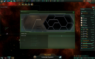
irm_view_sector_controlは画面を記述する特定のcontainerWindowTypeを参照します。両者の名前は完全に一致しなければならず、一致しないとクラッシュします。原文はenclave_trader_windowを例にしています。外交イベントとして呼んでいないため、ポートレート、帝国名などは出ませんが、独自画面の土台にはなります。
整理
既存の項目やコンテナを削除すると、ゲームが必須GUIインスタンスを見つけられずクラッシュします。削除せず、すべて隠します。背景画像やポートレートが不要なら、次のコンテナの幅と高さを0にします。
containerWindowType = { name = "portrait_background" … }
containerWindowType = { name = "portrait" … }

containerWindowType = {
    name = "portrait"
    position = { x = 17 y = 45 }
    size = { width = 0 height = 0 } # ポートレートを隠す
    clipping = yes
    …
}
画面外へ移動する方法もあります。説明文の暗い背景や選択肢一覧を隠す例です。
buttonType = {
    name = "alien_message_background"
    size = { x = 485 y = 240 }
    position = { x = -1110 y = -11430 }
    spriteType = "GFX_tiles_dark_area_cut_8"
    alwaysTransparent = yes
}

listboxType = {
    name = "option_list"
    position = { x = 11450 y = 11175 }
    backGround = ""
    size = { x = -0 y = -0 }
    spacing = 1
    scrollbartype = "standardlistbox_slider"
    borderSize = { x = 0 y = 0 }
    orientation = "UPPER_LEFT"
}
既存の見出しを画面外へ移し、名前を変えた独自見出しを追加します。
instantTextBoxType = {
    name = "heading"
    font = "malgun_goth_24"
    text = "DIPLOMACY"
    position = { x = -1120 y = -1115 }
    maxWidth = 543
    maxHeight = 22
    fixedSize = yes
    alwaysTransparent = yes
}

# 独自見出し
instantTextBoxType = {
    name = "irm_some_header"
    font = "malgun_goth_24"
    text = "ui_some header" # ローカライズファイルを参照する見出しテキスト
    position = { x = 20 y = 5 }
    maxWidth = 543
    maxHeight = 22
    fixedSize = yes
    alwaysTransparent = yes
}
ウィンドウを拡大して背景を変えます。
containerWindowType = {
    name = "irm_faction_overview"
    …
    size = { width = 660 height = 300 }
    background = {
        name = "background"
        quadTextureSprite = "GFX_tile_outliner_bg"
    }
}
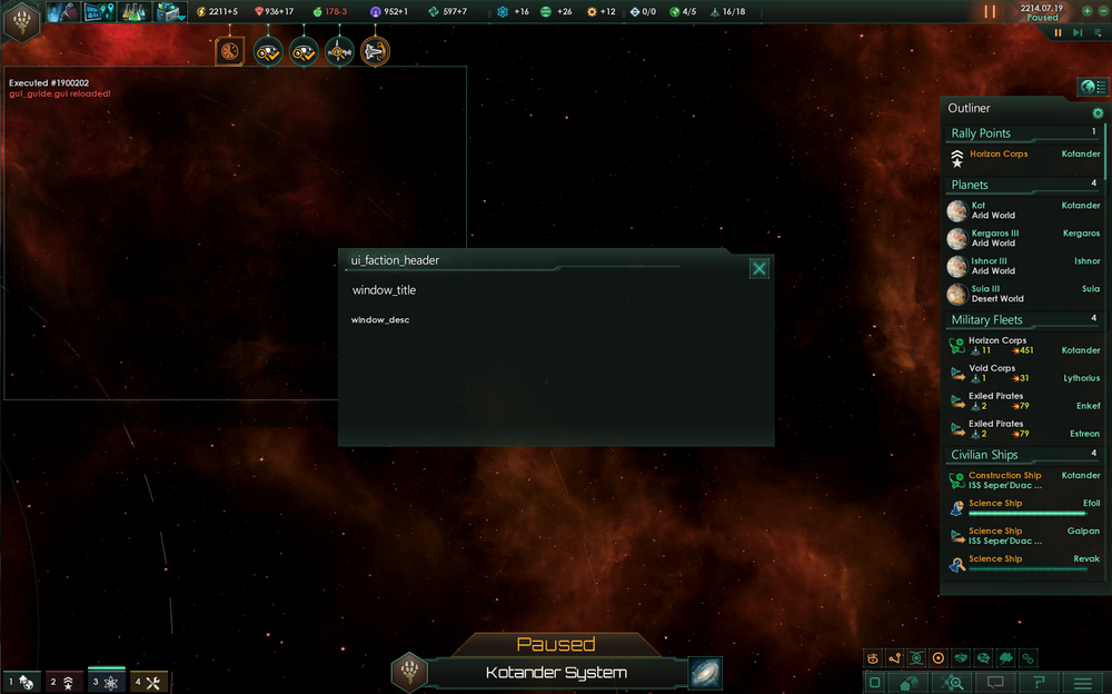
GUIファイル例
原文の例では不要要素を移動し、使わないフォントなどの不要な指定を除去したうえで、1ブロックへまとめています。コンテナの論理順序は変更せず、元の順番を維持してください。
guiTypes = {

    ### 派閥概要GUI ###

    containerWindowType = {
        name = "irm_faction_overview"
        orientation = center
        origo = center
        moveable = yes
        size = { width = 660 height = 300 }

        background = {
            name = "background"
            quadTextureSprite = "GFX_tile_outliner_bg"
        }

        iconType = {
            name = "hex_bg"
            spriteType = "GFX_hex_bg"
            position = { x = -10 y = -14 }
            alwaysTransparent = yes
        }
        iconType = {
            name = "empire_header_line"
            quadTextureSprite = "GFX_line_long"
            position = { x = 6 y = 22 }
            alwaysTransparent = yes
        }

        buttonType = {
            name = "close"
            quadTextureSprite = "GFX_close"
            position = { x= -42 y = 12 }
            orientation = "UPPER_RIGHT"
            shortcut = "ESCAPE"
            clicksound = "back_click"
        }

        # 独自見出し
        instantTextBoxType = {
            name = "irm_some_header"
            font = "malgun_goth_24"
            text = "ui_faction_header"  # 見出しテキスト
            position = { x = 20 y = 5 }
            maxWidth = 543
            maxHeight = 22
            fixedSize = yes
            alwaysTransparent = yes
        }

        ### 以下はすべて非表示または画面外へ移動 ###

        buttonType = { name = "focus_button" position = { x = -1180 y = -1112 } spriteType = "GFX_fleetview_focus" } # 非表示
        instantTextBoxType = { name = "heading" font = "malgun_goth_24" position = { x = -1120 y = -115 } } # 非表示
        buttonType = { name = "alien_message_background" size = { x = 0 y = 0 } position = { x = -1110 y = -11430 } spriteType = "GFX_tiles_dark_area_cut_8" } # 非表示
        buttonType = { name = "confirm_button" quadTextureSprite = "GFX_standard_button_142_34_button" } # 非表示
        containerWindowType = {
            name = "portrait_background"
            position = { x = -1117 y = -1145 }
            size = { width = 0 height = 0 }     # ポートレートウィンドウを隠す
            iconType = { name = "event_picture" spriteType = "GFX_diplomacy_portrait_frame" } # 非表示
            iconType = { name = "portrait" spriteType = "GFX_portrait_character" } # 非表示
        }
        containerWindowType = {
            name = "portrait"
            position = { x = -1117 y = -1145 }
            size = { width = 0 height = 0 } # ポートレートウィンドウを隠す
            iconType = { name = "portrait" spriteType = "GFX_portrait_gamesetup_mask" } # 非表示
            iconType = { name = "black_frame" spriteType = "GFX_diplomacy_portrait_shadow_frame" } # 非表示
            iconType = { name = "stripes_1" spriteType = "GFX_diplomacy_stripes_2" } # 非表示
            iconType = { name = "city_frame" spriteType = "GFX_diplomacy_portrait_frame" } # 非表示
        }
        iconType = { name = "empire_info_bg" spriteType = "GFX_diplomacy_dark_fade_bg" } # 非表示
        instantTextBoxType = { name = "empire_name" font = "malgun_goth_24" } # 非表示
        instantTextBoxType = { name = "empire_government_type" font = "cg_16b" } # 非表示
        instantTextBoxType = { name = "empire_personality_type" font = "cg_16b" } # 非表示
        overlappingElementsBoxType = { name = "empire_ethics_icons" position = { x = -1145 y = -11138 } } # 非表示
        iconType = { name = "empire_flag" spriteType = "GFX_empire_flag_128" position = { x = -1125 y = -11235 } } # 非表示
        containerWindowType = {
            name = "leader_details"
            position = { x = -1125 y = -1175 }
            containerWindowType = { name = "empire_traits_box" } # 非表示
            instantTextBoxType = { name = "empire_traits_label" font = "cg_16b" } # 非表示
            overlappingElementsBoxType = { name = "leader_traits" } # 非表示
            instantTextBoxType = { name = "leader_name" font = "cg_16b" } # 非表示
            instantTextBoxType = { name = "leader_species" font = "cg_16b" } # 非表示
        }
        containerWindowType = {
            name = "opinion_window"
            position = { x = -1127 y = -11110 }
            size = { width = 94 height = 30 }
            iconType = { name = "their_opinion_icon" spriteType = "GFX_diplomacy_opinion" } # 非表示
            instantTextBoxType = { name = "their_opinion" font = "cg_16b" }
        }

        ### 外交イベント ###

        containerWindowType = {
            name = "EVENT_DIPLO"
            position = { x = 2 y = 50 }
            #size = { width = 563 height = 220 }
            moveable = no

            instantTextBoxType = {
                name = "action_title"
                font = "malgun_goth_24"
                position = { x = 20 y = 0 }
                maxWidth = 200
                alwaysTransparent = yes
            }
            instantTextBoxType = {
                name = "action_desc"
                font = "malgun_goth_24"
                position = { x = 490 y = 0 }
                maxWidth = 500
                maxHeight = 180
                orientation = "UPPER_LEFT"
                format = center
                alwaysTransparent = yes
                text_color_code = "H"
            }
            listboxType = { name = "option_list" position = { x = -11500 y = -1130 } } # 選択肢一覧を隠す
        }
        # 説明文の節
        instantTextBoxType = {
            name = "alien_message"
            font = "cg_16b"
            position = { x = 20 y = 100 }
            maxWidth = 465
            maxHeight = 220
            format = left
            scrollbartype = "standardtext_slider"
        }
    }
}
出典: Stellaris Wiki — Interface modding(原文更新日: 2025年5月26日、版ID 106757)
翻訳日: 2026年9月17日 / 対応バージョン: 3.7
本ページは原文Wiki(CC BY-SA 3.0)の内容を翻訳した非公式ファン翻訳です。